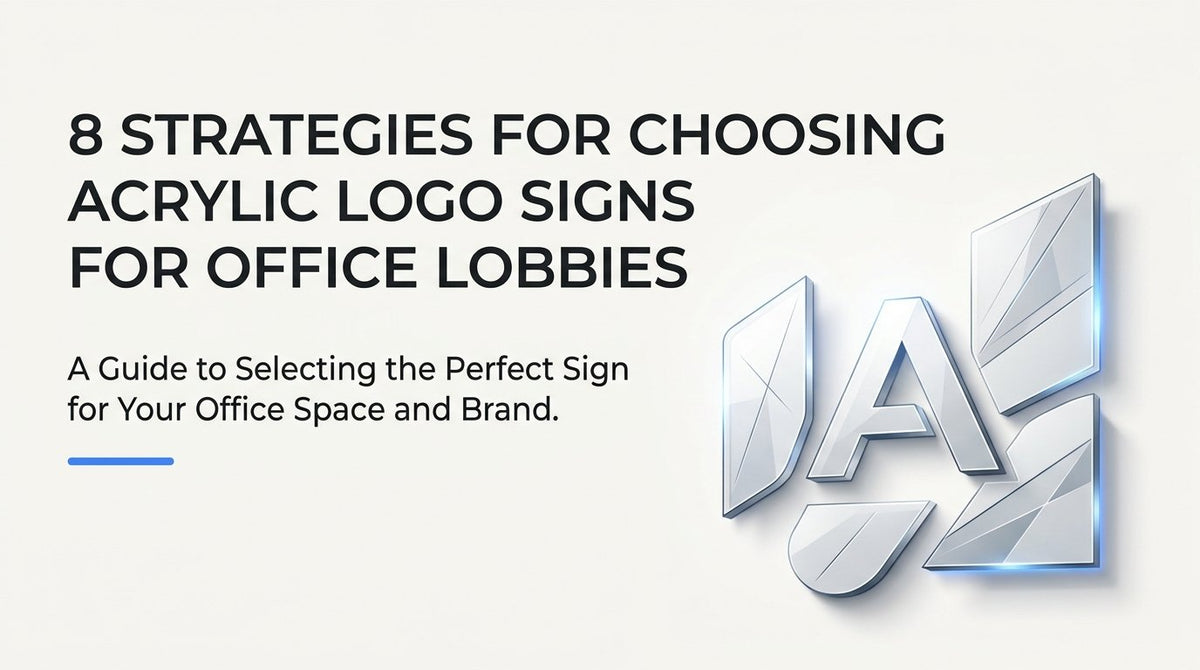
8 Strategies for Choosing Acrylic Logo Signs for Office Lobbies
Updated October 2026. When a visitor walks into your lobby, the logo sign on the wall does more work than most people realize. It sets the tone for the meeting, the interview, or the sales pitch that follows, before anyone says a word. The format you choose, round or square, clear or full-color, flat or dimensional, says something about how your company operates, whether you intend it or not. These strategies are built for the office manager, marketing lead, or facilities coordinator who has already looked at acrylic logo sign options and sizing ranges and now needs to decide which format fits their specific wall, room, and brand goals.
1. Match the Acrylic Shape to the Room's Architecture
Panel shape is a design decision, not a checkbox. A lobby's existing lines, whether it has a curved reception desk, an arched doorway, or a grid of angular columns, set a visual rhythm that the sign either joins or interrupts. Choosing a shape that echoes what's already in the room makes a sign feel like it was planned as part of the space rather than added to it after the fact.
Consider a tech company whose reception desk curved in a gentle arc beneath a rounded archway. Instead of defaulting to a rectangular panel, they chose a circular acrylic sign that mirrored the desk's curve. The result read as built-in, almost architectural, rather than like a sign mounted as an afterthought.
To apply this in your own space:
- Photograph the wall from the entrance and from a seated position at reception.
- Note the dominant shapes already present: arches, angular columns, straight sightlines, or curved furniture.
- Use the acrylic collection page as a baseline for available shapes and sizing.
- Adjust proportions, not just shape, so the panel's scale complements the wall rather than fighting it.
The common mistake here is defaulting to a rectangle simply because it's the standard option, even when the space has strong curves or angles a rectangle clashes with. Gauge success informally: do visitors and staff comment that the sign looks intentional, or does it get treated as background clutter nobody notices?
2. Clear Acrylic with Standoffs for Glass-Front and Minimalist Lobbies
Standoff mounting holds a panel a short distance off the wall using metal or acrylic spacers, rather than adhering it flush to the surface. When you pair that hardware with clear acrylic, the wall finish behind the sign becomes part of the design. This works especially well in minimalist lobbies where the goal is to let architecture and materials speak rather than covering them with an opaque panel.
A law firm with a polished stone accent wall used this approach: clear acrylic letters on standoffs let the stone's natural texture and veining remain fully visible behind the logo. The sign felt like an extension of the wall's finish instead of a separate object stuck on top of it.
Before specifying clear acrylic on standoffs, confirm the wall finish can actually serve as a background. Painted drywall, natural stone, and wood paneling all work; a busy patterned wallpaper or a cluttered wall of framed art usually does not, since the logo will compete with what's behind it. Standoff length should match the depth of the wall's texture, longer spacers for uneven stone, shorter ones for flat painted surfaces, and placement should be centered on the sightline a visitor sees first when walking through the entrance.
The pitfall to avoid is installing clear acrylic in a dim or low-contrast entryway without adding supplemental lighting. Clear letters rely on shadow, reflection, and contrast to read; in flat lighting they can nearly disappear. Check legibility from the entrance doorway and again from the average seated eye height at the reception desk before finalizing the install.
3. Full-Color Direct UV Print for Brand Color Accuracy
Direct UV printing applies ink straight onto the acrylic surface rather than layering a separate vinyl overlay on top. That distinction matters for brands with gradients, multi-color logos, or strict Pantone requirements, since UV printing can hold color transitions and fine detail that a cut vinyl decal can't replicate as cleanly.
A franchise location needed its lobby sign to match corporate brand guidelines exactly across every store location. Cut vinyl in a single flat color couldn't reproduce the gradient built into their icon, but a full-color UV printed acrylic panel matched the guideline colors and gradient in one pass.
To get accurate results, supply a vector logo file with exact brand color values, Pantone or CMYK, rather than a generic image pulled from a website or presentation deck. If color accuracy against brand standards is critical, request a physical proof before committing to full production runs across multiple locations.
The most common misstep is sending a low-resolution or rasterized file with very thin strokes or small text. At sign scale, those fine details can blur or drop out entirely during printing. Once installed, do a side-by-side comparison of the printed sign against your brand style guide, viewed under the lobby's actual lighting rather than under office fluorescents or daylight from a laptop screen, since ambient light shifts how printed color reads.
4. 3D Layered Acrylic Lettering for High-Visibility Reception Walls
Dimensional lettering, raised acrylic letters mounted with spacers rather than printed flat, introduces shadow and depth that shift throughout the day as ambient light changes. That subtle movement gives a logo a sense of permanence and craftsmanship that a flat printed panel can't match on its own.
A corporate headquarters mounted dimensional acrylic letters over a subtly painted focal wall directly behind reception. As daylight moved across the lobby throughout the day, the letters cast soft shifting shadows, turning a static logo into something that felt alive and considered.
This treatment earns its impact on the wall visitors see first, the one directly facing the entrance or positioned behind the reception desk. If your logo includes both an icon and a wordmark, consider pairing dimensional letters with a flat printed acrylic backer panel underneath for added depth and visual layering.
The mistake to avoid is installing dimensional lettering in a spot where the shadow effect can't actually be seen, a narrow side hallway, a corner wall, or anywhere outside typical sightlines. The whole value of the raised letters depends on visibility and lighting angle. Before finalizing placement, check whether the shadow and depth effect is visible from the entrance and from the main seating area, not just from a few feet away.
5. Scale the Sign to the Space, Not Just the Wall
It's tempting to fill available wall space with the largest panel that fits, but sign size should be driven by viewing distance, not wall dimensions. A sign sized correctly for a small conference room will look oversized and clumsy in a two-story lobby, and vice versa.
One company handled this well across two spaces: a compact acrylic logo sign sized for a 6 to 8 foot viewing distance in a small conference room, and a substantially larger panel in their two-story lobby, sized so the logo remained legible from across an open atrium.
Measure the typical distance from which each sign will actually be viewed before choosing letterform height. In a small huddle room, that might be eight feet from the doorway. In an open lobby, it could be thirty feet or more from the entrance to the reception wall. Leave proportional negative space around the logo rather than stretching it to fill the entire panel width, since generous margin often reads as more premium than a logo crammed edge to edge.
The common mistake is choosing the largest available panel size for every space by default, which results in a sign that overwhelms a small conference room wall and feels disconnected from the room's scale. Test readability from the room's typical seating or standing position before finalizing size, not from up close at the wall itself.
6. Layer Dimensional Letters Over a Printed Acrylic Panel
Combining a full-color UV-printed backer with raised dimensional letters or an icon mounted on top creates a two-material build with genuine visual layering. This approach works well for headquarters lobbies and flagship locations where the sign needs to carry more visual weight than a single flat panel.
One headquarters lobby used a UV-printed panel in a solid brand color as the backer, then mounted separate raised acrylic letters spelling the company name on top of it. The layering created clear depth and made the sign a genuine focal point rather than a flat graphic.
To execute this well, design the printed backer and the raised element as two coordinated files from the start, rather than designing the backer first and figuring out the raised layer later. Specify contrasting colors or finishes between the two layers so the raised piece reads clearly against the printed background instead of blending into it.
The most frequent error is selecting a letter color too close to the printed backer's color, which flattens the visual separation the whole technique depends on. White letters on a deep navy backer, for example, hold contrast; navy letters on a slightly darker navy backer disappear. Once installed, check contrast between the raised letters and the printed background under the lobby's actual lighting, since some combinations that look fine on a screen lose separation under warm interior lighting.
7. Frosted or Etched Acrylic Accents for Conference Room Branding and Privacy
Frosted and etched acrylic diffuse light and sightlines while still carrying a logo mark, which makes them useful for conference rooms with glass walls where full privacy blinds would block natural light entirely. An etched or frosted band across glass reinforces brand presence in a secondary space without requiring the room to feel closed off.
A professional services firm etched its logo into a frosted band running across a glass conference room wall. The etching branded the space and softened sightlines into the room, without fully blocking the natural light that made the room usable throughout the day.
Treat this as a secondary branding element, not your primary lobby identity piece. It works best as a smaller accent in conference rooms or along interior glass partitions. Keep the etched logo simple and single-color for the clearest, most durable result; this technique doesn't hold fine multi-color detail the way UV printing does.
Avoid attempting to etch a complex, multi-color logo into frosted acrylic. Detail and legibility both suffer, and the mark can end up looking muddy rather than clean. After installation, check whether the etched area provides enough privacy or diffusion for its purpose while the brand mark remains clearly recognizable at a glance.
8. Match the Mounting Method to the Wall Substrate
The wall behind your sign determines which mounting method will actually hold up over time. Flush adhesive mounting, standoff mounting, and mounting plates each suit different substrates, and choosing the wrong one creates problems that only show up after installation, when they're much harder to fix.
One lobby illustrates the trade-off well: an uneven natural stone accent wall required standoff mounting with longer spacers to bridge the surface's irregularities, while an adjacent section of flat drywall in the same lobby used flush mounting for a companion sign. Same brand, same sign package, two different mounting approaches based entirely on what was behind the panel.
- Identify the wall substrate, drywall, stone, tile, brick, or glass, before ordering any mounting hardware.
- For uneven surfaces, confirm standoff projection length is long enough to bridge the surface's variation without the panel rocking or gapping unevenly.
- For flat, consistent surfaces like painted drywall, flush mounting typically gives the cleanest look with fewer visible components.
- Coordinate installation timing with any wall finishing work, painting, tiling, or stone installation, so the sign goes up after the wall is truly finished.
The common mistake is specifying flush mounting for an uneven stone, brick, or tiled wall. The panel ends up with visible gaps in some spots and unstable contact in others, which shortens its useful life and looks unfinished. After installation, check for flush, gap-free contact across the entire panel, or, with standoffs, a consistent gap distance from edge to edge.
Walking the Wall Before You Order
Start with shape and finish, strategies one through three, since those decisions shape everything that follows. Once you know whether you're working with a curved architectural feature, a stone accent wall, or a brand that demands exact color matching, sizing and mounting become much more straightforward to confirm. Walk the actual lobby or conference room wall with a tape measure and a camera before finalizing an order: note the substrate, the typical viewing distance, and the lighting conditions at different times of day. Those details, more than any catalog spec, determine whether a sign feels built for the space or simply placed in it.
Our design and production team works through these decisions with clients across Cypress, Katy, Tomball, and Northwest Houston every week, and we ship acrylic logo signs nationwide for companies managing multiple office locations. If you're ready to move from planning to production, Experience JYS: Order Now.