Custom Business Signs: What Information Should Your Sign Include?
A business sign has limited space, and every element needs a reason to be there. The goal is not to fit your entire business onto one sign. It is to give people the information they need in the place where they need it.
For one business, that might mean making the company name easy to recognize from outside. For another, it could mean directing visitors to the right entrance, promoting a specific service, or telling customers how to get in touch.
When planning custom business signs, start with the purpose of the sign before deciding what text, logos, or contact details to include.
1. Start With the Main Purpose of the Sign
Before choosing wording or laying out the design, decide what the sign needs to accomplish.
Is it identifying your business? Helping customers find you? Explaining what you offer? Promoting a current service or offer? Directing visitors through a building?
The answer determines which information deserves the most attention.
For example, a storefront sign generally needs to make the business identifiable. A directional sign needs to tell people where to go. A promotional sign needs to communicate the offer or message quickly enough for the intended audience to understand it.
Trying to accomplish all these goals on one sign can make the message harder to follow.
Write down the single most important thing someone should understand after seeing the sign. Use that as the starting point for the design.
2. Include the Information Customers Actually Need
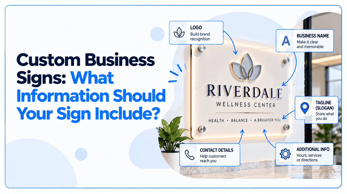
Not every business sign needs the same content. Depending on its purpose, your sign may include some of the following elements.
Business name or logo
For a sign intended to identify your business, the name or logo is usually the starting point. Use the version that matches your current branding and make sure it remains recognizable at the expected viewing distance.
If your business name does not clearly communicate what you do, a short service description may help.
Main message or service
A sign can identify the business while also explaining what customers can expect.
For example, a business name might be paired with a concise description such as “Physical Therapy,” “Auto Repair,” or “Custom Printing.” These are illustrative examples, not a requirement for every sign.
Choose wording that helps your intended audience understand the business without making the sign unnecessarily crowded.
Location or directional information
If visitors need help finding the business, entrance, reception area, or a particular department, directional information may be more useful than a list of services.
Keep the instruction direct. The customer should not have to interpret a long sentence to work out where to go.
Contact information
A phone number, website, email address, or QR code can be useful when the sign is intended to generate inquiries or help customers take the next step.
Choose the contact method that makes sense for the situation. A sign viewed by passing traffic has different practical limits from a sign inside a reception area, where visitors have more time to read.
Promotional details
For a temporary promotion, the key information may include the offer, product or service, and a relevant date or condition.
Include only the details needed to understand the promotion. If important terms apply, make sure they are accurate and readable rather than squeezing them into an already crowded layout.
The guiding principle is simple: include information that serves the sign's purpose, not every detail available about your business.
3. Match the Content to the Type of Business Sign
The best content depends on where the sign will be placed and what the audience needs from it.
Storefront signs

A storefront sign primarily helps people identify a business at its location. Start with the business name or logo. A short descriptor may be useful when the name alone does not explain the business.
Additional contact details or promotional messaging should earn their place in the design. The available space, viewing distance, and surrounding environment all affect how much information is practical.
For more help choosing a format and planning a storefront project, read our guide to storefront signs in Cypress, TX.
Directional and wayfinding signs

These signs help people navigate a location. The priority is the destination or instruction, such as an entrance, reception area, office, or parking location.
Use familiar wording and clear directional cues. Branding can help the signs feel consistent with the business, but it should not compete with the information visitors need to follow.
Promotional and temporary signs

Promotional signs need to communicate a specific offer, service, or announcement. Put the main message first and include the supporting details necessary to understand it.
For a roadside or yard sign, viewing time may be very limited. Avoid treating it like a brochure. A short message and one clear next step are often more practical than multiple service descriptions and several contact methods.
Our guide to getting more results from yard signs covers considerations specific to that format.
Office and reception signs

An office sign may need to identify the company, display a logo, or help visitors recognize the correct reception area.
If the purpose is brand identification, a company name and logo may be enough. If visitors need directions or department information, those details should be treated as a separate communication need.
For a more focused discussion of lobby signage, see our guide to acrylic logo signs for office lobbies.
These examples are starting points, not fixed formulas. The right content depends on the location, audience, and purpose of the individual sign.
4. Decide Whether to Include a Phone Number, Website, or QR Code
Contact information can help customers take action, but adding every available option can make the design harder to read.
Before including contact details, ask how someone is likely to interact with the sign.
- Phone number: Useful when calling is a meaningful next step and the number can be read comfortably.
- Website: Useful when people need more information, want to browse services, or need to make an inquiry.
- QR code: Useful when someone can reasonably stop, access their phone, and scan it. The destination should be relevant and easy to use on a mobile device.
- Physical address: Useful when location information helps customers find or distinguish the business.
- Email address: May suit professional or business-to-business inquiries, depending on the audience and context.
You do not need all five.
Choose the contact method that best supports the sign's purpose. For example, a sign intended to identify a building may not need a QR code, while a sign inside a venue may have a useful role directing visitors to an online menu or registration page.
If you use a QR code, test it before approving the artwork. Confirm that it points to the correct destination and remains large and clear enough for the expected scanning distance.
5. Prioritize Information by Viewing Distance
A sign viewed from across a parking lot cannot carry the same amount of detail as one placed at a reception desk.
The farther away people will be when they see the sign, the more important it becomes to prioritize the main message and avoid unnecessary text. Signs intended for close reading can accommodate more information, provided the layout remains clear.
Use a simple hierarchy:
- Primary information: What people need to recognize or understand first.
- Supporting information: A short service description, direction, or other detail that clarifies the message.
- Action information: Contact details or a next step, when relevant.
Not every sign needs all three levels.
Review the design at the approximate size and viewing distance where it will be used. A layout that looks clear when enlarged on a computer screen may feel crowded when viewed from across a room or through a storefront window.
If the sign will be seen by people moving past it, simplify the wording and give the most important information visual priority.
6. Keep Branding Consistent Without Overloading the Design
Your sign should feel like part of your business, but brand consistency does not require displaying every brand element at once.
Use the appropriate logo, colors, and typography. Keep the main message easy to identify, and make sure decorative details do not compete with essential information.
A complex logo, a long business name, several service descriptions, multiple contact methods, and promotional graphics may not all fit comfortably into the same composition.
When space is limited, decide what the sign must communicate first. Secondary details can sometimes be placed on another sign or shared through your website and other customer touchpoints.
The aim is to make the business recognizable while keeping the message easy to understand.
7. Check Whether Your Sign Has Specific Requirements
Some business signs are subject to requirements beyond marketing and design preferences. Depending on the sign's purpose and location, these may include landlord approval, local sign regulations, accessibility standards, or other applicable rules.
Do not assume that a design suitable for a promotional display will also meet the requirements for a regulated sign.
For example, certain signs used for permanent room identification or accessible facilities may be subject to specific requirements for character formats, tactile lettering, or Braille under applicable accessibility standards.
Confirm the requirements that apply to your particular sign, building, and jurisdiction before production. When necessary, consult the property manager, local authority, or an appropriately qualified professional.
These checks should happen before the artwork is finalized, especially when the sign will be installed at a commercial property.
8. Review Every Detail Before Approving the Artwork
Even a well-designed sign can create problems if the information is incorrect.
Before approving the proof, check the actual wording and details, not just the overall appearance.
Use this checklist:
- Business name and logo are correct.
- Spelling, punctuation, and capitalization have been checked.
- Phone numbers, URLs, email addresses, and QR codes are accurate, if included.
- Promotional wording, dates, and terms are correct, if applicable.
- The most important information is easy to identify.
- The text is appropriate for the expected viewing distance.
- Dimensions and orientation match the intended location.
- The artwork uses the correct brand assets.
- Placement, mounting, and any required approvals have been considered.
- Applicable sign requirements have been confirmed.
Review the proof at a practical size and pay particular attention to small text, contact details, and elements close to the edges.
JYS Sign & Print Co. outlines customer responsibilities for reviewing artwork, content, dimensions, and color expectations in its proof, artwork, and color policy. Review the proof carefully and confirm that the final design reflects the information you intend to display.
9. Prepare the Right Details Before Requesting a Quote
A clear brief makes it easier to discuss the right sign for your business.
Before contacting a sign provider, prepare the following information where available:
- Purpose: What the sign needs to communicate or accomplish.
- Placement: Where it will be installed or displayed.
- Dimensions: The available space or target finished size.
- Environment: Whether the sign will be used indoors, outdoors, or in a covered area.
- Content: Final wording, logo, contact details, and any required graphics.
- Quantity: How many signs are needed.
- Timing: The date the sign is needed.
- Artwork: Existing files, brand guidelines, or reference images.
- Installation: Whether mounting or installation support is required.
You do not need to know every production detail before asking for help. Providing the intended use, location, approximate dimensions, and available artwork gives the conversation a useful starting point.
For a broader look at materials, artwork preparation, and the ordering process, see our guide to large-format printing in Cypress, TX.
Get Your Custom Business Sign Ready for Production
The strongest business sign is not necessarily the one with the most information. It is the one that gives the intended audience the right information in the right order.
Start with the sign's purpose. Choose the details that support that purpose, keep the main message prominent, and review every word before approving the artwork.
When you're ready to plan your project, JYS Sign & Print Co. can help you work through the sign's intended use, dimensions, artwork, and production requirements. Bring your project details and existing brand files so the next steps can be based on what your business actually needs.